Optimization Algorithm i.e Gradient Descent Algorithm(27th September)

The formula of the cost function is given by

J(mi)=1/2n*(sum of (Ypi-Yi)^2 till i reaches n)

where n is the number of data points

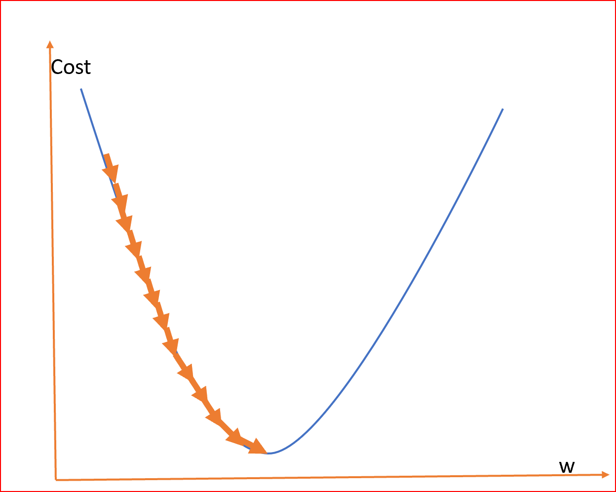
As we can see the cost function in the graph reduces till it reaches the minimum value.

This minimum value is the least error in our Linear Regression.

We need to find this minimum value

In order to find the minimum value we will use something called a Gradient Descent Algorithm or Convergence Algorithm.

So Formula for the convergence algorithm is

do{

M(new)=M(old)-(Learning Rate Alpha)*(partial derivative with respect to slope m)J(m)

Calculate cost function J(M(new)) and J(M(old))

}while(J(M(new))>J(M(old))


After the above algorithm, the least value of the cost function/Least error function is J(M(old)), and the slope for which the error is least is M(old)

Now the line will be drawn to the nearest data points with the equation

Y=M(old)Xi

where Xi is x points or an independent variable


Steps to caluculate least value of Residual/Least error squared function/Cost function(25 September)

We will be given data points let’s say Diabetes vs Obesity.

So as per the CDC data, we have the percentage of people suffering from diabetes for each country which is differentiated by FIPS number.

What we can do is to check whether obesity is affecting diabetes or not.

So obesity will be the independent variable and diabetes will be the dependent variable.

In order to plot linear regression for diabetes against obesity.

Let’s see if we have both the points for common areas

X(Obesity)={Xp1,Xp2,Xp3……..}

Y(Diabetes)={Yp1,Yp2,Yp3,……..}

Now we must find a line that best represents the above values

line equation-.

Yi=mXi+c

where c is the y-intercept. Let’s say we draw a line from the origin so c=0

Yi=mXi

Now we have to select different slopes {m1,m2,m3……mi} or select different angles from where the line is to be drawn in the first quadrant

After that, we have to calculate the mean difference of points from the line we draw that is {Y1, Y2, Y3, Y4} to points that we obtain from the data set here it is Obesity percentage {Yp1, Yp2, Yp3, Yp4…..}

This mean difference is called a Cost function/Least Error Squared Function/Residual Error

The formula of the cost function is given by

J(mi)=1/2n*(sum of (Ypi-Yi)^2 till i reaches n)

where n is the number of points

Linear Regression Basics(22th September)

To know linear regression we need to understand why it came and what it does as a whole.

When we get any data set let’s say how many people are obese vs. inactive.

We will plot a graph where the x-axis is the percentage of people inactive whereas the y-axis is the percentage of people obese. What we will get is a graph full of points.

So linear regression is a machine learning algorithm that is used to predict future anomalies. So in order to predict we will draw a straight line based on current data and see if our line is closest to the data points that are already present. If it is then we can say that for the changing x-axis the point we will get in line will be the best possible prediction.

As it’s been seen the red line is predicted linear regression which is nearer to the data points and hence for the data points or let’s say future x value the predicted y value will be nearest to be accurate.


So in order to find this line we can use the squared error function(Cost Function) and minimize the value. The minimum value will be the line we are looking for.

Here hypothesis is the line equation we are looking for. Which looks like y=mx+c.


Peformed Cpu usage with time plot with basic python(20th September)

In order to learn the usage of matplotlib.pyplot, I have plotted a graph with Google Chrome’s CPU Usage Vs. Time

Code->

import matplotlib.pyplot as plt
x=[]
y=[]
for line in open('CPUData.dat','r'):
lines = [i for i in line.split()]
x.append(int(lines[0]))
y.append(float(lines[1]))
plt.title("CPU_UsageVSTime")
plt.xlabel("Time")
plt.ylabel("CPU_Usage")
plt.plot(x,y,marker='o',c='g')
plt.show()

Basic terms in statistics(18th september-Friday)

5 Measures in statistics

  1.  The measure of central tendency
  2. Measure of dispersion
  3. Gaussian Distribution
  4. Z-score
  5. Standard Normal Distribution


Central Tendency– Refers to the measure used to determine the center of distribution of data. To measure there are 3 terms Mean, Median, and Mode.

  • Mean is the average of all the data. That is the sum of data by the number of data
  • Median in statistics and probability theory, the median is the value separating the higher half from the lower half of a data sample, a population, or a probability distribution.
  • Mode is the most frequent number—that is, the number that occurs the highest number of times.

The measure of Dispersion refers to how data is been scattered around the central tendency. In order to measure dispersion. We calculate two quantities: variance and standard deviation.

  • Standard Deviation in statistics is a measure of the amount of variation or dispersion of a set of values. A low standard deviation indicates that the values tend to be close to the mean of the set, while a high standard deviation indicates that the values are spread out over a wider range.
  • Variance is the expectation of the squared deviation from the mean of a random variable. The standard deviation is obtained as the square root of the variance.

Outliers- In statistics, an outlier is a data point that differs significantly from other observations. An outlier may be due to variability in the measurement, an indication of novel data, or maybe the result of experimental error; the latter are sometimes excluded from the data set.

For example, there  are 10 numbers

{1,1,2,2,3,3,4,5,5,6}

Mean=Sum of observations/Number of observations=3.2

Now suppose we add a number that is very large to the given set of numbers let’s say 100

{1,1,2,2,3,3,4,4,5,6,100}

Now Mean comes out to be 12

Previous Mean =3.2

Mean due to the presence of an outlier=12

As we can see due to presence of an outlier, mean value is signicantly changed. So in order to make correct calcualtions on data, outliers should be removed as far as possible. However the middle value or median won’t have any effect due to presence of an outlier.


Percentile It is a value below which a certain percentage of observation lie.

for example->

Dataset:2,2,3,4,5,5,5,6,7,8,8,8,8,9,9,10,11,11,12

What is the percentile of 10?

Percentile rank of 10 =16/20 * 100=80%ile


In order to remove outliers there is Five number summary

  1. Minimimum
  2. First Quartile(Q1)
  3. Median
  4. Third Quartile(Q3)
  5. Maximum

Minimum and Maximum values can define the range of data set.

While, The lower quartile, or first quartile (Q1), is the value under which 25% of data points are found when they are arranged in increasing order. The upper quartile, or third quartile (Q3), is the value under which 75% of data points are found when arranged in increasing order.

In order to remove outlier’s we follow following steps

  1. IQR(Interquartile Range)=Q3-Q1
  2. Lower Fence=Q1-1.5(IQR)
  3. Upper Fence=Q3+1.5(IQR)

So any value which above and below Lower and Upper Fence is an outlier. Which could be removed


Basic statistical function learning with python(Wednesday-15th September)

import seaborn as sns
Learned about Seaborn library, a Python data visualization library based on matplotlib. It helps to draw statistical graphics.

import numpy as np
Learned about NumPy which is a package used for scientific computing in Python. It provides all sorts of shape manipulation, sorting, selecting, I/O, discrete Fourier transforms, basic linear algebra, basic statistical operations, random simulation, and much more.
Note- NumPy doesn’t provide calcuations of mode as mode is just counting of occurences while NumPy is used for mathematical calculations.

import matplotlib.pyplot as plt
Learned that matplotlib is a comprehensive library for creating static, animated, and interactive visualizations in Python.

import statistics
Statistics is imported as it is used to calculate the mode for a given data.

#mean, median, mode
df=sns.load_dataset('tips')
In order to load any data set seaborn library is used
 If no parameter is given it displays the first five rows
df.head()
index,total_bill,tip,sex,smoker,day,time,size
0,16.99,1.01,Female,No,Sun,Dinner,2
1,10.34,1.66,Male,No,Sun,Dinner,3
2,21.01,3.5,Male,No,Sun,Dinner,3
3,23.68,3.31,Male,No,Sun,Dinner,2
4,24.59,3.61,Female,No,Sun,Dinner,4
.head function returns first 5 rows if no parameter is given to it

calculate the mean of total bills
np.mean(df['total_bill'])
19.78594262295082

 calculate the median of total bills
np.median(df['total_bill'])
17.795

 calculate mode using statics
statistics.mode(df['total_bill'])
13.42
 NumPy is only involved in numeric calculations and doesn’t count frequencies of occurrences so we can’t use NumPy

Plot Linear Regression with obesity as independent variable and diabetes as dependent variable(13 Sep 2023)

Below is the linear regression result, in which the estimated coefficients are->:
b_0 = 2.055980432211423
b_1 = 0.27828827666358774

A Python program written to obtain the above regression is

import numpy as np
import matplotlib.pyplot as plt
import pandas as pd
import numpy as np
def estimate_coefficients(x, y):
# number of observations/points
no_observation = np.size(x)
# mean of x and y vector
slope_x = np.mean(x)
slope_y = np.mean(y)
# calculating cross-deviation and deviation about x
S_xy = np.sum(y*x) - no_observation*slope_y*slope_x
S_xx = np.sum(x*x) - no_observation*slope_x*slope_x
# calculating regression coefficients
b_1 = S_xy / S_xx
b_0 = slope_y - b_1*slope_x
return (b_0, b_1)
def plot_regression(x, y, b):
# plotting the actual points as scatter plot
plt.scatter(x, y, color="m",
marker="o",s=30)
# predicted response vector
diabetes_pred = b[0] + b[1]*x
# plotting the regression line
plt.plot(x, diabetes_pred, color="g")
# putting labels
plt.xlabel('x')
plt.ylabel('y')
# function to show plot
plt.show()
def main():
# observations / data
diabt = pd.read_excel('diabetes.xlsx')
diabArray = np.array(diabt)
diabetesList = list(diabArray)
obses = pd.read_excel('obesity.xlsx')
obsArray = np.array(obses)
obesityList = list(obsArray)
obesityArray = []
diabetesArray = []
for fpsObesity in obesityList:
for fpsDiabetes in diabetesList:
if fpsDiabetes[1] == fpsObesity[1]:
obesityArray.append(fpsObesity[4])
diabetesArray.append(fpsDiabetes[4])
obesityOnX = np.array(obesityArray)
diabetesOnY = np.array(diabetesArray)
# estimating coefficients
coefficient = estimate_coefficients(obesityOnX, diabetesOnY)
print("coefficients are->:\nb_0 = {}\
\nb_1 = {}".format(coefficient[0], coefficient[1]))
# plotting regression line
plot_regression(obesityOnX, diabetesOnY, coefficient)
if __name__ == "__main__":
main()
Currently, I will read more about residuals and how to minimize error with respect to coefficients i.e. changing b_0 and b_1.
Also will study if the error with current coefficients is minimum or not. As the shape of the graph obtained is fanning out.