
STL Decompostion (December 1)
Let us return to our Economic Indicators dataset to discuss trends and seasonality.
We can determine whether there is a long-term trend in any of the economic indicators (like the number of international flights at Logan International Airport) using Time series analysis techniques. A common method is to plot historical data on international flight counts over time. This graphical representation allows you to visually inspect the data for patterns, trends, and potential seasonality.

- From 2013 to 2015, there is an initial upward trend, indicating a gradual increase in the number of international flights.
- From 2015 to 2016, the plot steepens, indicating a faster increase in international flights during this time period. This could indicate a period of rapid growth or a shift in influencing factors.
- From 2016 to 2018, the plot maintains the same angle as in the previous years (2013 to 2015). This indicates a pattern of sustained growth, but at a relatively consistent rate, as opposed to the sharper increase seen in the previous period.
To extract underlying trends, we could also calculate and plot a moving average or use more advanced time series decomposition methods. These techniques can assist in identifying any long-term patterns or fluctuations in international flight counts, providing valuable insights into the airport’s long-term dynamics.
Moving Average: A moving average is a statistical calculation that is used to analyse data points by calculating a series of averages from different subsets of the entire dataset. A “window” denotes the number of data points in each average. The term “rolling” refers to the calculation being performed iteratively for each successive subset of data points, resulting in a smooth trend line.
- Let’s take the window as 12.
- Averages and subsets: Each subset of 12 consecutive points in the dataset is considered by the moving average.
- For each subset, it computes the average of these 12 points.
- As the window moves across your flight data, there will be N-12+1 subsets (N is the number of total datapoints you have)
- The Average (x) is interpreted as follows: Assume the first window’s average is x. This x is the smoothed average value for that specific time point. It is the 12-month average of the ‘logan_intl_flights’ value.
- Highlighting a Trend: The moving average’s purpose is to smooth out short-term fluctuations or noise in the data.

- The Orange Line in Context: The orange line’s peaks and valleys represent data trends over the specified window size. If the orange line rises, it indicates an increasing trend over the selected time period. If it is falling, it indicates a downward trend.
When compared to the original data, the fluctuations are less abrupt, making it easier to identify overall trends. - A confidence interval around the moving average is typically represented by the light orange region. A wider confidence interval indicates that the data points within each window are more uncertain or variable.
STL or Seasonal-Trend decomposition using LOESS is a time series decomposition method that divides a time series into three major components: trend, seasonal, and residual. Each component is described below:
- Before we do the STL decomposition, let’s understand what frequency is. Because STL is based on the assumption of regular intervals between observations, having a well-defined frequency is critical.
- Not every time series inherently has a well-defined frequency. While some time series data may naturally exhibit a regular and consistent pattern at specific intervals, others may not follow a clear frequency.
- How do check if your time series has a well defined frequency?
- After you set the Date as your index, you can check using df.index.freq to see what the frequency is. If it’s ‘None’, you will have to explicitly set it.
- df.index.to_series().diff().value_counts(): This will show you the counts of different time intervals between observations in your time series. Observe the most common interval, as it is likely the frequency of your time series.
 The idea is to observe the most common interval, which is likely the frequency of your time series. The output helps verify that the chosen frequency aligns with the actual structure of the
- data.df.index.freq = ‘MS’: This explicitly sets the frequency of the time series to ‘MS’, which stands for “Month Start.”
- Based on this assumed frequency, it decomposes the time series into seasonal, trend, and residual components. By explicitly setting the frequency, you ensure that STL correctly interprets the data and captures the desired patterns.
- Trend Component: The trend component in time series data represents the long-term movement or underlying pattern. It is created by smoothing the original time series with a locally weighted scatterplot smoothing (LOESS). LOESS is a non-parametric regression technique that fits data to a smooth curve

- Seasonal Component: The seasonal component captures recurring patterns or cycles that occur over a set period of time.
STL, unlike traditional seasonal decomposition methods, allows for adaptive seasonality by adjusting the period based on the data. The seasonal component values represent systematic and repetitive patterns that occur at a specific frequency, typically associated with seasons or other regular data cycles. These values, which can be positive or negative, indicate the magnitude and direction of the seasonal effect.

- Residual Component: After removing the trend and seasonal components, the residual component represents the remaining variability in the data. It is the “noise” or irregular fluctuations in time series that are not accounted for by trend and seasonal patterns.

Now what is this residual component? If you look, your original time series data has various patterns, including seasonal ups and downs, a long-term trend, and some random fluctuations. Residuals are essentially the leftover part of your data that wasn’t explained by the identified patterns. They are like the “random noise” or “unpredictable” part of your data. It is nothing but the difference between the observed value and the predicted value. I plan on addressing the entire logic behind this in a separate blog.
So technically, if your model is good, the residuals should resemble random noise with no discernible structure or pattern.
And if you see a pattern in your residuals, it means your model did not capture all of the underlying dynamics.
Which months do you believe have the highest number of international flights? Take a wild guess. Is it around Christmas, Thanksgiving, umm.. Valentine’s Day?
We can isolate and emphasise the recurring patterns inherent in international flight numbers by using the seasonal component obtained from STL decomposition rather than the original data. The seasonal component represents the regular, periodic fluctuations, allowing us to concentrate on the recurring variations associated with different months.

By analysing this component, we can identify specific months with consistently higher or lower international flight numbers, allowing us to gain a better understanding of the dataset’s seasonal patterns and trends. This method aids in the discovery of recurring behaviours that may be masked or diluted in raw, unprocessed data.


The month with the highest average seasonal component is represented by the tallest bar. This indicates that, on average, that particular month has the most flights during the season. Shorter bars, on the other hand, represent months with lower average seasonal effects, indicating periods with lower international flight numbers. Based on the seasonal patterns extracted from the data, analysing the heights of these bars provides insights into seasonal variations and helps identify which months have consistently higher or lower international flight numbers.
Time Series Analysis with Apple stock price Forecasting(November 29)
Why don’t we do something more intriguing now that we have a firm understanding of time series? For those who share my curiosity, stocks offer a captivating experience with their charts, graphs, green and red tickers, and numbers. But, let’s review our understanding of stocks before we get started.
- What is a Stock? A stock represents ownership in a company. When you buy a stock, you become a shareholder and own a portion of that company.
- Stock Price and Market Capitalization: The stock price is the current market value of one share. Multiply the stock price by the total number of outstanding shares to get the market capitalization, representing the total value of the company.
- Stock Exchanges: Stocks are bought and sold on stock exchanges, such as the New York Stock Exchange (NYSE) or NASDAQ. Each exchange has its listing requirements and trading hours.
- Ticker Symbol: Each stock is identified by a unique ticker symbol. For example, Apple’s ticker symbol is AAPL.
- Types of Stocks:
- Common Stocks: Represent ownership with voting rights in a company.
- Preferred Stocks: Carry priority in receiving dividends but usually lack voting rights.
- Dividends: Some companies pay dividends, which are a portion of their earnings distributed to shareholders.
- Earnings and Financial Reports: Companies release quarterly and annual financial reports, including earnings. Positive earnings often lead to a rise in stock prices.
- Market Index: Market indices, like the S&P 500 or Dow Jones, track the performance of a group of stocks. They give an overall sense of market trends.
- Risk and Volatility: Stocks can be volatile, and prices can fluctuate based on company performance, economic conditions, or global events.
- Stock Analysis: People use various methods for stock analysis, including fundamental analysis (company financials), technical analysis (historical stock prices and trading volume), and sentiment analysis (public perception).
- yfinance: yfinance is a Python library that allows you to access financial data, including historical stock prices, from Yahoo Finance.
- Stock Prediction Models: Machine learning models, time series analysis, and statistical methods are commonly used for stock price prediction. Common models include ARIMA, LSTM, and linear regression.
- Risks and Caution: Stock trading involves risks. It’s essential to diversify your portfolio, stay informed, and consider seeking advice from financial experts.
When working with stock data using the yfinance library in Python, the dataset typically consists of historical stock prices and related information.
TSFP Further(November 27)
Let’s attempt a thorough analysis of our models today. Residual analysis, as we all know, is a crucial stage in time series modelling to evaluate the goodness of fit and make sure the model assumptions are satisfied. The discrepancies between the values predicted by the model and the observed values are known as residuals.
Here’s how we can perform residual analysis for your AR and MA models:
- Compute Residuals:
- Calculate the residuals by subtracting the predicted values from the actual values.
- Plot Residuals:
- To visually examine the residuals for trends, patterns, or seasonality, plot them over time. The residuals of a well-fitted model should look random and be centred around zero.
- Autocorrelation Function (ACF) of Residuals:
- To see if there is any more autocorrelation, plot the residuals’ ACF. The ACF plot shows significant spikes, which suggest that not all of the temporal dependencies were captured by the model.
- Histogram and Q-Q Plot:
- Examine and compare the residuals histogram with a normal distribution. To evaluate normality, additionally employ a Q-Q plot. Deviations from normalcy could indicate that there is a breach in the model’s presumptions.
If you’re wondering why you should compare the histogram of residuals to a normal distribution or why deviations from normality may indicate that the model assumptions are violated, you’re not alone. Normality is a prerequisite for many statistical inference techniques, such as confidence interval estimation and hypothesis testing, that the residuals, or errors, follow a normal distribution. Biassed estimations and inaccurate conclusions can result from deviations from normality.
The underlying theory of time series models, including ARIMA and SARIMA models, frequently assumes residual normality. If the residuals are not normally distributed, the model may not accurately capture the underlying patterns in the data.
Here’s why deviations from normality might suggest that the model assumptions are violated:
- Validity of Confidence Intervals:
- The normality assumption is critical for constructing valid confidence intervals. The confidence intervals may be unreliable if the residuals are not normally distributed, resulting in incorrect uncertainty assessments..
- Outliers and Skewness:
- Deviations from normality in the histogram could indicate the presence of outliers or residual skewness. It is critical to identify and address these issues in order to improve the model’s performance.
Let’s run a residual analysis on whatever we’ve been doing with “Analyze Boston” data.
- Residuals over time: This plot describes the pattern and behaviour of the model residuals, or the discrepancies between the values that the model predicted and the values that were observed, over the course of the prediction period. It is essential to analyse residuals over time in order to evaluate the model’s performance and spot any systematic trends or patterns that the model may have overlooked. There are couple of things to look for:
- Ideally, residuals should appear random and show no consistent pattern over time. A lack of systematic patterns indicates that the model has captured the underlying structure of the data well.
- Residuals should be centered around zero. If there is a noticeable drift or consistent deviation from zero, it may suggest that the model has a bias or is missing important information.
- Heteroscedasticity: Look for consistent variability over time in the residuals. Variations in variability, or heteroscedasticity, may be a sign that the model is not accounting for the inherent variability in the data.
- Outliers: Look for any extreme values or outliers in the residuals. Outliers may indicate unusual events or data points that were not adequately captured by the model

- The absence of a systematic pattern suggests that the models are adequately accounting for the variation in the logan_intl_flights data.
- Residuals being mostly centered around the mean is a good indication. It means that, on average, your models are making accurate predictions. The deviations from the mean are likely due to random noise or unexplained variability.
- Occasional deviations from the mean are normal and can be attributed to random fluctuations or unobserved factors that are challenging to capture in the model. As long as these deviations are not systematic or consistent, they don’t necessarily indicate a problem.
- Heteroscedasticity’s absence indicates that the models are consistently managing the variability. If the variability changed over time, it could mean that the models have trouble during particular times.
- The ACF (Autocorrelation Function) of residuals: demonstrates the relationship between the residuals at various lags. It assists in determining whether, following the fitting of a time series model, any residual temporal structure or autocorrelation exists. The ACF of residuals can be interpreted as follows:
- No Significant Spikes: The residuals are probably independent and the model has successfully captured the temporal dependencies in the data if the ACF of the residuals decays rapidly to zero and does not exhibit any significant spikes.
- Significant Spikes: The presence of significant spikes at specific lags indicates the possibility of residual patterns or autocorrelation. This might point to the need for additional model improvement or the need to take into account different model structures.


- There are no significant spikes in our ACF, it suggests that the model has successfully removed the temporal dependencies in the data.
- Histogram and Q-Q plot:
- Look at the shape of the histogram. It should resemble a bell curve for normality. A symmetric, bell-shaped histogram suggests that the residuals are approximately normally distributed. Check for outliers or extreme values. If there are significant outliers, it may indicate that the model is not capturing certain patterns in the data. A symmetric distribution has skewness close to zero. Positive skewness indicates a longer right tail, and negative skewness indicates a longer left tail.
- In a Q-Q plot, if the points closely follow a straight line, it suggests that the residuals are normally distributed. Deviations from the line indicate departures from normality. Look for points that deviate from the straight line. Outliers suggest non-normality or the presence of extreme values. Check whether the tails of the Q-Q plot deviate from the straight line. Fat tails or curvature may indicate non-normality.
- A histogram will not reveal much to us because of the small number of data points we have. Each bar’s height in a histogram indicates how frequently or how many data points are in a given range (bin).

 See what I mean?
Another Experiments with TSFP(November 22).
If I were you, I would question why we haven’t discussed AR or MA in isolation before turning to S/ARIMA. This is due to the fact that ARIMA is merely a combination of them, and you can quickly convert an ARIMA to an AR by offsetting the parameter for the MA and vice versa. Before we get started, let’s take a brief look back. We have seen how the ARIMA model operates and how to manually determine the proper method for determining the model parameters through trial and error. I have two questions for you: is there a better way to go about doing this? Secondly, we have seen models like AR, MA, and their combination ARIMA, how do you choose the best model?
Simply put, an MA model uses past forecast errors (residuals) to predict future values, whereas an AR model uses past values of the time series to do so. It assumes that future values are a linear combination of past values, with coefficients representing the weights of each past value. It makes the assumption that the future values are the linear sum of the forecast errors from the past.
Choosing Between AR and MA Models:
Understanding the type of data is necessary in order to select between AR and MA models. An AR model could be appropriate if the data shows distinct trends, but MA models are better at capturing transient fluctuations. Model order selection entails temporal dependency analysis using statistical tools such as the Partial AutoCorrelation Function (PACF) and AutoCorrelation Function (ACF). Exploring both AR and MA models and contrasting their performance using information criteria (AIC, BIC) and diagnostic tests may be part of the iterative process.
A thorough investigation of the features of a given dataset, such as temporal dependencies, trends, and fluctuations, is essential for making the best decision. Furthermore, taking into account ARIMA models—which integrate both AR and MA components—offers flexibility for a variety of time series datasets.
In order to produce the most accurate and pertinent model, the selection process ultimately entails a nuanced understanding of the complexities of the data and an iterative refinement approach.
Let’s get back to our data from “Analyze Boston”. To discern the optimal AutoRegressive (AR) and Moving Average (MA) model orders, Autocorrelation Function (ACF) and Partial Autocorrelation Function (PACF) plots are employed.


Since the first notable spike in our plots occurs at 1, we tried to model the AR component with an order of 1. And guess what? After a brief period of optimism, the model stalled at zero. The MA model, which had the same order and a flat line at 0, produced results that were comparable. For this reason, in order to identify the optimal pairing of AR and MA orders, a comprehensive search for parameters is necessary.


As demonstrated in my earlier post, these plots can provide us with important insights and aid in the development of a passable model. However, we can never be too certain of anything, and we don’t always have the time to work through the labor-intensive process of experimenting with the parameters. Why not just have our code handle it.


To maximise the model fit, the grid search methodically assessed different orders under the guidance of the Akaike Information Criterion (AIC). As a result of this rigorous analysis, the most accurate AR and MA models were found, and they were all precisely calibrated and predicted. I could thus conclude that (0,0,7) and (8,0,0) were the optimal orders for MA and AR respectively.

Moving Average Model with TSFP and Analyze Boston (November 20th).
The Moving Average Model: or MA(q), is a time series model that predicts the current observation by taking into account the influence of random or “white noise” terms from the past. It is a part of the larger category of models referred to as ARIMA (Autoregressive Integrated Moving Average) models. Let’s examine the specifics:
- Important Features of MA(q):
-
- Order (q): The moving average model’s order is indicated by the term “q” in MA(q). It represents the quantity of historical white noise terms taken into account by the model. In MA(1), for instance, the most recent white noise term is taken into account.
- White Noise: The current observation is the result of a linear combination of the most recent q white noise terms and the current white noise term. White noise is a sequence of independent and identically distributed random variables with a mean of zero and constant variance.
- Mathematical Equation: An MA(q) model’s general form is expressed as follows:
Y t = μ + Et + (θ(1) E(t−1) )+( θ(2) E(t-2) )+…+(θqEt−q)
Y t is the current observation.
The time series mean is represented by μ.
At time t, the white noise term is represented by Et.
The weights allocated to previous white noise terms are represented by the model’s parameters, which are θ 1, θ 2,…, θ q.
- Key Concepts and Considerations:
-
- Constant Mean (μ): The moving average model is predicated on the time series having a constant mean (μ).
- Stationarity: The time series must be stationary in order for MA(q) to be applied meaningfully. Differencing can be used to stabilise the statistical characteristics of the series in the event that stationarity cannot be attained.
- Model Identification: The order q is a crucial aspect of model identification. It is ascertained using techniques such as statistical criteria or autocorrelation function (ACF) plots.
- Application to Time Series Analysis:
-
- Estimation of Parameters: Using statistical techniques like maximum likelihood estimation, the parameters θ 1, θ 2, …, θ q, are estimated from the data.
- Model Validation: Diagnostic checks, such as residual analysis and model comparison metrics, are used to assess the MA(q) model’s performance.
- Forecasting: Following validation, future values can be predicted using the model. Based on the observed values and historical white noise terms up to time t−q, the forecast at time t is made.
- Use Cases:
-
- Capturing Short-Term Dependencies: When recent random shocks have an impact on the current observation, MA(q) models are useful for detecting short-term dependencies in time series data.
- Complementing ARIMA Models: To create ARIMA models, which are strong and adaptable in capturing a variety of time series patterns, autoregressive (AR) and differencing components are frequently added to MA(q) models.
Let’s try to fit an MA(1) model to the ‘logan_intl_flights’ time series from Analyze Boston. But before that it’s important to assess whether the ‘logan_intl_flights’ time series is appropriate for this type of model. The ACF and PACF plots illustrate the relationship between the time series and its lag values, which aids in determining the possible order of the moving average component (q).

With “TSFP” and Analyze Boston(November 17).
- In time series analysis, stationarity is an essential concept. A time series that exhibits constant statistical attributes over a given period of time is referred to as stationary. The modelling process is made simpler by the lack of seasonality or trends. Two varieties of stationarity exist:
- Strict Stationarity: The entire probability distribution of the data is time-invariant.
- Weak Stationarity: The mean, variance, and autocorrelation structure remain constant over time.
- Transformations like differencing or logarithmic transformations are frequently needed to achieve stationarity in order to stabilise statistical properties.
- Let’s check the stationarity of the ‘logan_intl_flights’ time series. Is the average number of international flights constant over time?

- A visual inspection of the plot will tell you it’s not. But let’s try performing an ADF test.

- The Augmented Dickey-Fuller (ADF) test is a prominent solution to this problem. Using a rigorous examination, this statistical tool determines whether a unit root is present, indicating non-stationarity. The null hypothesis of a unit root is rejected if it is less than the traditional 0.05 threshold, confirming stationarity. The integration of domain expertise and statistical rigour in this comprehensive approach improves our comprehension of the dataset’s temporal dynamics.
How Time Series Forecasting works(15th November)?
I feel compelled to share the insightful knowledge bestowed upon me by this book on time series analysis as I delve deeper into its pages.
Defining Time Series: A time series is a sequence of data points arranged chronologically, comprising measurements or observations made at regular and equally spaced intervals. This type of data finds widespread use in various disciplines such as environmental science, biology, finance, and economics. The primary goal when working with time series is to understand the underlying patterns, trends, and behaviors that may exist in the data over time. Time series analysis involves modeling, interpreting, and projecting future values based on past trends.
Time Series Decomposition: Time series decomposition is a technique for breaking down a time series into its fundamental components: trend, seasonality, and noise. These elements enhance our understanding of data patterns.
– Trend: Represents the long-term movement or direction of the data, helping identify if the series is rising, falling, or staying the same over time.
– Seasonality: Identifies recurring, regular patterns in the data that happen at regular intervals, such as seasonal fluctuations in retail sales.
– Noise (or Residuals): Represents sporadic variations or anomalies in the data not related to seasonality or trends, essentially the unexplained portion of the time series.
Decomposing a time series into these components aids in better comprehending the data’s structure, facilitating more accurate forecasting and analysis.
Forecasting Project Lifecycle: The entire process of project lifecycle forecasting involves predicting future trends or outcomes using historical data. The lifecycle typically includes stages such as data collection, exploratory data analysis (EDA), model selection, training the model, validation and testing, deployment, monitoring, and maintenance. This iterative process ensures precise and current forecasts, requiring frequent updates and modifications.
Baseline Models: Baseline models serve as simple benchmarks or reference points for more complex models. They provide a minimal level of prediction, helping evaluate the performance of more sophisticated models.
– Mean or Average Baseline: Projects a time series’ future value using the mean of its historical observations.
– Naive Baseline: Forecasts the future value based on the most recent observation.
– Seasonal Baseline: Forecasts future values for time series with a distinct seasonal pattern using the average historical values of the corresponding season.
Random Walk Model: The random walk model is a straightforward but powerful baseline for time series forecasting, assuming that future variations are entirely random. It serves as a benchmark to assess the performance of more advanced models.
Exploring the ‘Economic Indicators’ dataset from Analyze Boston, we can examine the baseline (mean) for Total International flights at Logan Airport. The baseline model computes the historical average, assuming future values will mirror this average. Visualization of the model’s performance against historical trends helps gauge its effectiveness and identify possible shortcomings for further analysis and improvement in forecasting techniques.
Time series exploration(13th November )
Within the expansive realm of data analysis, a nuanced understanding of the distinctions among various methodologies is imperative. Time series analysis stands out as a specialized expertise tailored for scrutinizing data collected over time. As we juxtapose time series methods against conventional predictive modeling, the distinctive merits and drawbacks of each approach come to light.
Time series analysis, epitomized by models like ARIMA and Prophet, serves as the linchpin for tasks where temporal dependencies shape the narrative. ARIMA employs three sophisticated techniques—moving averages, differencing, and autoregression—to capture elusive trends and seasonality. On the other hand, Prophet, a creation of Facebook, adeptly handles missing data and unexpected events.
In essence, the choice between time series analysis and conventional predictive modeling hinges on the intrinsic characteristics of the available data. When unraveling the intricacies of temporal sequences, time series methods emerge as the superior option. They furnish a tailored approach for discerning and forecasting patterns over time that generic models might overlook. Understanding the strengths and limitations of each data navigation technique aids in selecting the most suitable tool for navigating the data landscape at hand.
Report
Reading about time series Analysis(6th November)
Today I read about time series analysis and planning to perform these analyses Also I am planning to explore temporal patterns and trends in incident data, such as identifying seasonality or making time-based predictions.
Heirarchial Clustering Algortithm applied in dataset(3rd November)
Clusters produced by Hierarchical Clustering closely resemble K-means clusters. Actually, there are situations when the outcome is precisely the same as k-means clustering. However, the entire procedure is a little different. Agglomerative and Divisive are the two types. The bottom-up strategy is called aggregative; the opposite is called divisive. Today, my primary focus was on the Agglomerative approach.
I became familiar with dendrograms, where the horizontal axis represents the data points and the vertical axis indicates the Euclidean distance between two points. Therefore, the clusters are more dissimilar the higher the lines. By examining how many lines the threshold cuts in our dendrogram, we can determine what dissimilarity thresholds to set. The largest clusters below the thresholds are the ones we need. In a dendrogram, the threshold is typically located at the greatest vertical distance that you can travel without touching any of the horizontal lines.
Adding to Clustering a method called the Elbow Method(1st November)
Extending Clustering will lead to an approach called the elbow method.
I plotted this graph, known as the WCSS, which shows how close the points in a group are to one another, to determine the number of clusters we need. It assisted me in determining the ideal number of groups at which the addition of another group is insignificant; this is known as the “elbow” point.
WCSS, or within cluster sum of squares, is essentially a gauge of how organised our clusters are. The sum of the squares representing the distances between each point and the cluster’s centre. We get neater clusters with lower WCSS. WCSS typically decreases as the number of clusters increases. The elbow method allows us to determine the ideal number of clusters.
Density based Spatial Clustering(30 October)
Today, I learned when and how to use Denisty-Based Spatial Clustering for Applications with Noise, or DBSCAN. Using a clustering algorithm, it is possible to locate densely packed groups of data points in a space. Unlike with k-means, we don’t really need to specify the number of clusters in advance. It is able to find collections of arbitrary shapes.

To investigate the difference in average ages between black and white guys further, I used frequentist statistical methods such as Welch’s t-test in addition to the Bayesian approaches.
This frequentist approach, in addition to the Bayesian studies, consistently and unambiguously shows a significant variation in mean ages. The convergence of results from frequentist and Bayesian approaches increases my confidence in the observed difference in average ages between the two groups.

Bayesian t-test (25th October)
Because I am certain that there is a statistically significant difference in average age of about seven, I used a Bayesian t-test strategy to account for this prior knowledge. However, the results showed an interesting discrepancy: the observed difference was found near the tail of the posterior distribution. This discrepancy and the way it showed how susceptible Bayesian analysis is to earlier specifications did not sit well with me.

Drawing the heat map(23rd October)
The difficulty in visualising a large collection of geocoordinated police shooting incidents is effectively transmitting information without overwhelming the viewer. First, I attempted to use the Folium library to create individual markers on a map to represent each incident. However, as the dataset grew larger, the computational cost of creating markers for each data point increased. As a more effective solution to this problem, I decided to use a HeatMap. The HeatMap can help to show incident concentration more succinctly and the distribution of events on the map more clearly. I improved the heatmap’s readability by adjusting its size and intensity with settings such as blur and radius.

The rate of killings of black americans are higher as compared to white,Whereas white americans are more in number.(20th October)
Although half of the people shot and killed by police are White, Black Americans are shot at a disproportionate rate. They account for roughly 14 percent of the U.S. population and are killed by police at more than twice the rate of White Americans. Hispanic Americans are also killed by police at a disproportionate rate.

Overwhelming majority of victims are young(18th October)
I sorted data in groups of ages and found out that, more than half of the victims that are shot are between age range from 20 to 40 and we justify that form the chart that I have drawn below.

Arrange data monthly(16th October)
As a matter of thought during festivals. Police shootings might increase and hence could get something interesting. I collated data monthly and below are the results that I have found.
As you can see from the image that there is slight increase in counts during March and August. But however there isn’t much increase.
March->741
August->702

Arrange data weekly(13th october)
In order to find something interesting I was curious to collate data weekly and check for some anomalies. However, I couldn’t find any significant cases and hence I have to drop the idea

11th October
I realized that to understand police shootings, we need more than just one year of data. So I went to the Washington post and downloaded data from 2015 to 2023.
After getting enough data. I reviewed how 2023 is performing compared to last year data and I found out that till now there have been 708 police killing while 2022 being the highest with total of 1096.
Report
4th October
-
-
Which state has higher diabetes percentage and what is physical inactivity and obesity of this state. Also which county among this states has a significant trend of diabetes and why is that?
-
The results of 2018, and 2016,2014,2010 Diabetes are as follows
Some of the top states are South Dakota and South Carolina
2018
Oglala Lakota County    South Dakota    17.9%
Williamsburg County     South Carolina  17.2%
Todd County             South Dakota    15.9%
2016
Dillon County         South Carolina     17.7%
Williamsburg County   South Carolina     17.0 %
Oglala Lakota County  South Dakota       16.6%
2014
Todd County             South Dakota       16.9
Oglala Lakota County    South Dakota       15.9
Ziebach County          South Dakota       15.8
Allendale County        South Carolina       15.3
2010
Orangeburg County  South Carolina           13.7
Hampton County     South Carolina           13.3
one thing to notice in 2010 South Dakota was not on the list. How come it became top in just 4 years? What happened?
One of the top counties was Todd County which topped among the list of diabetes.
2010 Todd County        South Dakota       10.0
2012 Todd County        South Dakota       15.0
2013 Todd County        South Dakota       16.7
2014 Todd County        South Dakota       16.9
Whereas physical inactivity data of Todd County has been decreased remarkably
2008 Todd County  South Dakota       31.7
2009 Todd County  South Dakota       28.1
2010 Todd County  South Dakota       26.5
2011 Todd County  South Dakota       26.4
Also, there has been a steep increase in obesity in Todd County since 2010
2010 Tood County  South Dakota 27.0
2011 Todd County  South Dakota 29.6
2012 Tood County  South Dakota 34.3
-
-
Which state and county has lowest diabetes rate and why is that?How this county has performed on the basis of physical inactivity and diabetes?
-
Lowest-> The lowest county is Teton County Wyoming and Routt County Colorado and Wyoming County Utah every year analysis is below->
2010
2010 Teton County Wyoming 3.8
2010 Routt County Colorado 4.0
2010 Summit County Utah 4.0
2014
2014 Teton County    Wyoming         4.2
2014 Boulder County  Colorado        4.3
2014 Summit County   Utah            4.0
2016
2016 Teton County   Wyoming       3.8
2016 Boulder County Colorado      4.4
2016 Eagle County   Colorado      4.4
2016 Douglas County Colorado      4.7
2016 Summit County      Utah        4.1
2018
2018 Teton County     Wyoming        3.8
2018 Summit County        Utah        4.8
2nd October
Outliers
Found outliers in all the data and removed them
Later got to know that outliers are not required to be removed. These are the measures of diabetes percentage in a country and there shouldn’t be any country with abnormal results.
So will have to look other metrices
29th September
A couple of things performed
- Found out the top 20 county who has diabetes physical inactivity and obesity and it seems like none of them match each other i.e. highest of each parameter is different from each other.
- Also plotted the graph and performed linear regression with obesity as the independent variable and diabetes as the dependent variable and got an r-square value of 0.04, which is too low to predict.
- Maybe the previous year’s data might show something.
Optimization Algorithm i.e Gradient Descent Algorithm(27th September)
The formula of the cost function is given by
J(mi)=1/2n*(sum of (Ypi-Yi)^2 till i reaches n)
where n is the number of data points
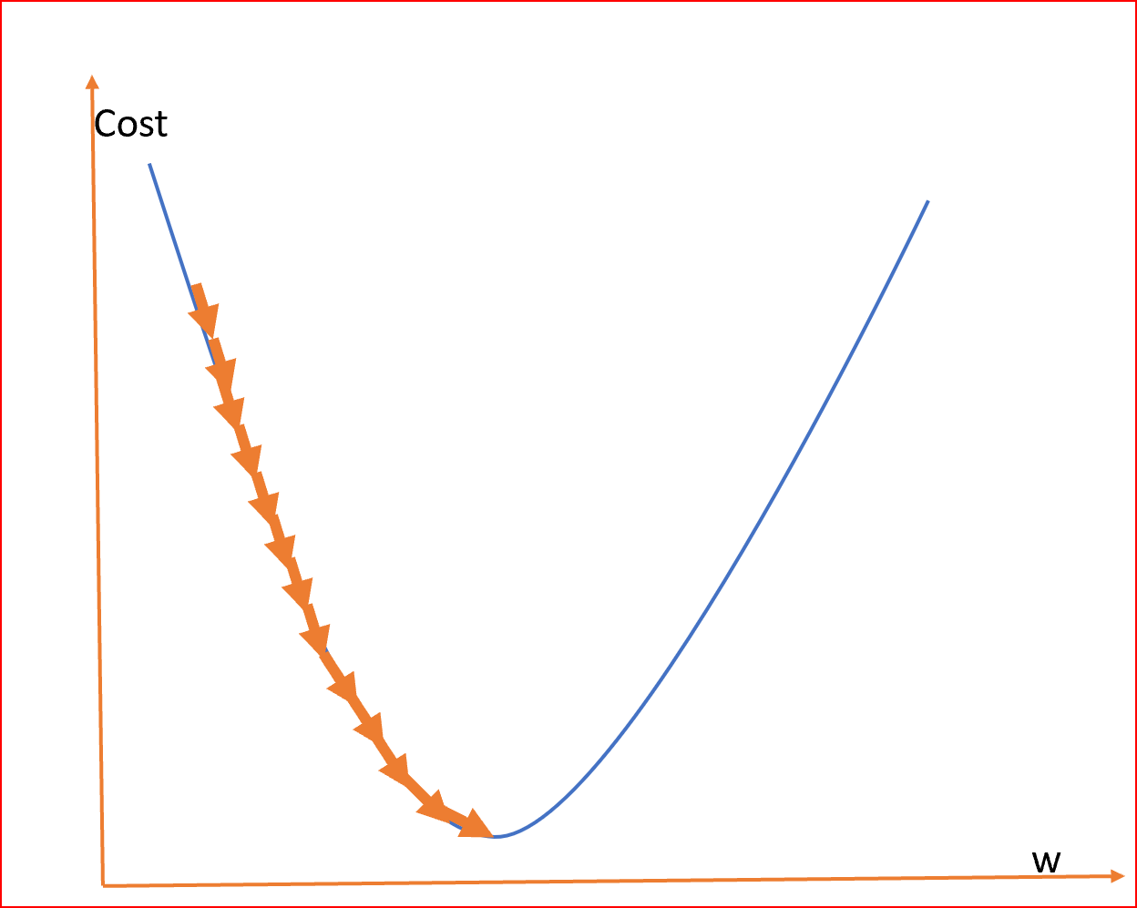
As we can see the cost function in the graph reduces till it reaches the minimum value.
This minimum value is the least error in our Linear Regression.
We need to find this minimum value
In order to find the minimum value we will use something called a Gradient Descent Algorithm or Convergence Algorithm.
So Formula for the convergence algorithm is
do{
M(new)=M(old)-(Learning Rate Alpha)*(partial derivative with respect to slope m)J(m)
Calculate cost function J(M(new)) and J(M(old))
}while(J(M(new))>J(M(old))
After the above algorithm, the least value of the cost function/Least error function is J(M(old)), and the slope for which the error is least is M(old)
Now the line will be drawn to the nearest data points with the equation
Y=M(old)Xi
where Xi is x points or an independent variable
Steps to caluculate least value of Residual/Least error squared function/Cost function(25 September)
We will be given data points let’s say Diabetes vs Obesity.
So as per the CDC data, we have the percentage of people suffering from diabetes for each country which is differentiated by FIPS number.
What we can do is to check whether obesity is affecting diabetes or not.
So obesity will be the independent variable and diabetes will be the dependent variable.
In order to plot linear regression for diabetes against obesity.
Let’s see if we have both the points for common areas
X(Obesity)={Xp1,Xp2,Xp3……..}
Y(Diabetes)={Yp1,Yp2,Yp3,……..}
Now we must find a line that best represents the above values
line equation-.
Yi=mXi+c
where c is the y-intercept. Let’s say we draw a line from the origin so c=0
Yi=mXi
Now we have to select different slopes {m1,m2,m3……mi} or select different angles from where the line is to be drawn in the first quadrant
After that, we have to calculate the mean difference of points from the line we draw that is {Y1, Y2, Y3, Y4} to points that we obtain from the data set here it is Obesity percentage {Yp1, Yp2, Yp3, Yp4…..}
This mean difference is called a Cost function/Least Error Squared Function/Residual Error
The formula of the cost function is given by
J(mi)=1/2n*(sum of (Ypi-Yi)^2 till i reaches n)
where n is the number of points
Linear Regression Basics(22th September)
To know linear regression we need to understand why it came and what it does as a whole.
When we get any data set let’s say how many people are obese vs. inactive.
We will plot a graph where the x-axis is the percentage of people inactive whereas the y-axis is the percentage of people obese. What we will get is a graph full of points.
So linear regression is a machine learning algorithm that is used to predict future anomalies. So in order to predict we will draw a straight line based on current data and see if our line is closest to the data points that are already present. If it is then we can say that for the changing x-axis the point we will get in line will be the best possible prediction.

As it’s been seen the red line is predicted linear regression which is nearer to the data points and hence for the data points or let’s say future x value the predicted y value will be nearest to be accurate.
So in order to find this line we can use the squared error function(Cost Function) and minimize the value. The minimum value will be the line we are looking for.

Here hypothesis is the line equation we are looking for. Which looks like y=mx+c.
Peformed Cpu usage with time plot with basic python(20th September)
In order to learn the usage of matplotlib.pyplot, I have plotted a graph with Google Chrome’s CPU Usage Vs. Time
Code->
import matplotlib.pyplot as pltx=[]y=[]for line in open('CPUData.dat','r'):lines = [i for i in line.split()]x.append(int(lines[0]))y.append(float(lines[1]))plt.title("CPU_UsageVSTime")plt.xlabel("Time")plt.ylabel("CPU_Usage")plt.plot(x,y,marker='o',c='g')plt.show()
Basic terms in statistics(18th september-Friday)
5 Measures in statistics
- The measure of central tendency
- Measure of dispersion
- Gaussian Distribution
- Z-score
- Standard Normal Distribution
Central Tendency– Refers to the measure used to determine the center of distribution of data. To measure there are 3 terms Mean, Median, and Mode.
- Mean is the average of all the data. That is the sum of data by the number of data
- Median in statistics and probability theory, the median is the value separating the higher half from the lower half of a data sample, a population, or a probability distribution.
- Mode is the most frequent number—that is, the number that occurs the highest number of times.
The measure of Dispersion refers to how data is been scattered around the central tendency. In order to measure dispersion. We calculate two quantities: variance and standard deviation.
- Standard Deviation in statistics is a measure of the amount of variation or dispersion of a set of values. A low standard deviation indicates that the values tend to be close to the mean of the set, while a high standard deviation indicates that the values are spread out over a wider range.
- Variance is the expectation of the squared deviation from the mean of a random variable. The standard deviation is obtained as the square root of the variance.
Outliers- In statistics, an outlier is a data point that differs significantly from other observations. An outlier may be due to variability in the measurement, an indication of novel data, or maybe the result of experimental error; the latter are sometimes excluded from the data set.
For example, there are 10 numbers
{1,1,2,2,3,3,4,5,5,6}
Mean=Sum of observations/Number of observations=3.2
Now suppose we add a number that is very large to the given set of numbers let’s say 100
{1,1,2,2,3,3,4,4,5,6,100}
Now Mean comes out to be 12
Previous Mean =3.2
Mean due to the presence of an outlier=12
As we can see due to presence of an outlier, mean value is signicantly changed. So in order to make correct calcualtions on data, outliers should be removed as far as possible. However the middle value or median won’t have any effect due to presence of an outlier.
Percentile It is a value below which a certain percentage of observation lie.
for example->
Dataset:2,2,3,4,5,5,5,6,7,8,8,8,8,9,9,10,11,11,12
What is the percentile of 10?
Percentile rank of 10 =16/20 * 100=80%ile
In order to remove outliers there is Five number summary
- Minimimum
- First Quartile(Q1)
- Median
- Third Quartile(Q3)
- Maximum
Minimum and Maximum values can define the range of data set.
While, The lower quartile, or first quartile (Q1), is the value under which 25% of data points are found when they are arranged in increasing order. The upper quartile, or third quartile (Q3), is the value under which 75% of data points are found when arranged in increasing order.
In order to remove outlier’s we follow following steps
- IQR(Interquartile Range)=Q3-Q1
- Lower Fence=Q1-1.5(IQR)
- Upper Fence=Q3+1.5(IQR)
So any value which above and below Lower and Upper Fence is an outlier. Which could be removed
Basic statistical function learning with python(Wednesday-15th September)
import seaborn as snsLearned about Seaborn library, a Python data visualization library based on matplotlib. It helps to draw statistical graphics.
import numpy as npLearned about NumPy which is a package used for scientific computing in Python. It provides all sorts of shape manipulation, sorting, selecting, I/O, discrete Fourier transforms, basic linear algebra, basic statistical operations, random simulation, and much more.
Note- NumPy doesn’t provide calcuations of mode as mode is just counting of occurences while NumPy is used for mathematical calculations.
import matplotlib.pyplot as pltLearned that matplotlib is a comprehensive library for creating static, animated, and interactive visualizations in Python.
import statisticsStatistics is imported as it is used to calculate the mode for a given data.
#mean, median, mode
df=sns.load_dataset('tips')In order to load any data set seaborn library is used
If no parameter is given it displays the first five rows
df.head()index,total_bill,tip,sex,smoker,day,time,size
0,16.99,1.01,Female,No,Sun,Dinner,2
1,10.34,1.66,Male,No,Sun,Dinner,3
2,21.01,3.5,Male,No,Sun,Dinner,3
3,23.68,3.31,Male,No,Sun,Dinner,2
4,24.59,3.61,Female,No,Sun,Dinner,4
.head function returns first 5 rows if no parameter is given to it
calculate the mean of total bills
np.mean(df['total_bill'])19.78594262295082
calculate the median of total bills
np.median(df['total_bill'])17.795
calculate mode using statics
statistics.mode(df['total_bill'])13.42
NumPy is only involved in numeric calculations and doesn’t count frequencies of occurrences so we can’t use NumPy
Plot Linear Regression with obesity as independent variable and diabetes as dependent variable(13 Sep 2023)
Below is the linear regression result, in which the estimated coefficients are->:
b_0 = 2.055980432211423
b_1 = 0.27828827666358774

A Python program written to obtain the above regression is
import numpy as npimport matplotlib.pyplot as pltimport pandas as pdimport numpy as npdef estimate_coefficients(x, y):# number of observations/pointsno_observation = np.size(x)# mean of x and y vectorslope_x = np.mean(x)slope_y = np.mean(y)# calculating cross-deviation and deviation about xS_xy = np.sum(y*x) - no_observation*slope_y*slope_xS_xx = np.sum(x*x) - no_observation*slope_x*slope_x# calculating regression coefficientsb_1 = S_xy / S_xxb_0 = slope_y - b_1*slope_xreturn (b_0, b_1)def plot_regression(x, y, b):# plotting the actual points as scatter plotplt.scatter(x, y, color="m",marker="o",s=30)# predicted response vectordiabetes_pred = b[0] + b[1]*x# plotting the regression lineplt.plot(x, diabetes_pred, color="g")# putting labelsplt.xlabel('x')plt.ylabel('y')# function to show plotplt.show()def main():# observations / datadiabt = pd.read_excel('diabetes.xlsx')diabArray = np.array(diabt)diabetesList = list(diabArray)obses = pd.read_excel('obesity.xlsx')obsArray = np.array(obses)obesityList = list(obsArray)obesityArray = []diabetesArray = []for fpsObesity in obesityList:for fpsDiabetes in diabetesList:if fpsDiabetes[1] == fpsObesity[1]:obesityArray.append(fpsObesity[4])diabetesArray.append(fpsDiabetes[4])obesityOnX = np.array(obesityArray)diabetesOnY = np.array(diabetesArray)# estimating coefficientscoefficient = estimate_coefficients(obesityOnX, diabetesOnY)print("coefficients are->:\nb_0 = {}\\nb_1 = {}".format(coefficient[0], coefficient[1]))# plotting regression lineplot_regression(obesityOnX, diabetesOnY, coefficient)if __name__ == "__main__":main()Currently, I will read more about residuals and how to minimize error with respect to coefficients i.e. changing b_0 and b_1.
Also will study if the error with current coefficients is minimum or not. As the shape of the graph obtained is fanning out.